Prior to the iPhone the majority of applications written were for desktop based devices, whether they be for a Mac or PC, or in some cases both. With the iPhone we saw an entire industry of mobile app development opening up from being a very niche, specialist field, into a field full of imposters who claimed they knew how to build a mobile application, just because they were now able to build and publish an iPhone app. The first generation of iPhone applications weren’t anything special and in fact if you compared the sophistication of most iPhone applications from that era to those being written for other mobile platforms, they were definitely a case of “beauty over brains” – You have to hand it to Apple, as they really did make it easy to build high quality apps that looked great, even if they suffered from a lack of substance.
So hang on, how does this relate to my messaging app? Well, whilst the quality and complexity of mobile applications has increased, one thing that hasn’t is that they are all single window. Due to the screen real estate, mobile application have a single window. With the introduction iPad and other tablets, we saw the use of split screen and master-detail style layouts but even these were all contained within a single window. In the context of a messaging application, whether it be Skype, Messenger, WhatsApp, Twitter etc, the layout is all basically the same – you have a list of contacts and/or groups, you tap into a contact or group and are taken to a chat interface where you can message. In the case of devices with more screen, often the contacts/groups will be listed in a pane on the left or right of the current conversation but in both cases, if you have multiple conversations going, you have to switch between active conversations.
I have nothing against the single window view when working on a mobile device, and I think I’m ok with it on a tablet device but when we graduate to a laptop/desktop we enter a world of inefficiencies and poor user experience. My mobile comes with me virtually everywhere I go but when I’m working, or at home surfing the internet, I’m typically on my laptop (as an aside, I’m running the Surface Book 2 i7 15” and it’s an amazing bit of kit – highly recommend it!). I’ll often have a combination of Messenger, Skype, Teams, LinkedIn and Twitter open and will switch between conversations within each as required. However, typically at any given point in time I’ll be involved in one or two conversations, and it’s really annoying to have to keep switching between these conversations and whatever else I might be doing. For example I might be having a couple of DM conversations on Twitter but at the same time catching up with what’s been happening on my main feed – this means I have to keep switching between conversations, rather than being able to keep them both open at once.
Now I think you can see where I’m going with this – I run an operating system that I think most of you will have heard of…. Windows…. not “Window” but “Windows” <<- plural!!
Why is it that very few modern applications make use of multiple-windows? Well, it’s because of the iPhone – for the last decade app developers (and don’t forget all those app designers who can’t comprehend how an app can use multiple windows) have been building apps that only use one window because building iPhone applications was where the money was, and still is. It doesn’t help that Android apps are also predominately single window.
Let’s go back a few years an look at some user interfaces that have been discarded in favour of the now pathetic single-window messaging app experience:
Do you remember mIRC?
Whilst it was technically one window, it did support having multiple conversations open at the same time using child windows.

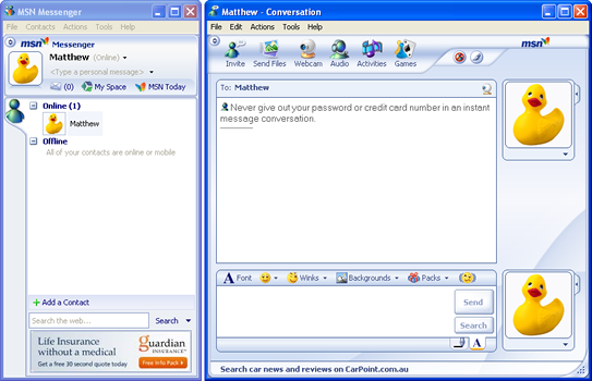
Do you remember MSN/Live Messenger?
It had multiple windows that you could open an arrange how you like. In fact you could force a window to stay on top of everything so it didn’t get obscured by other windows you might be switching between.

So where to from here?
Well the good news is that Windows app developers already have great multi-windowing support out of the box – you just need to build your application to take advantage of it (see https://docs.microsoft.com/en-us/windows/uwp/design/layout/show-multiple-views).
The bad news is that I doubt any of the major messaging services will take advantage of this in the short term, so we’re going to be stuck with a sub-optimal experience. Neither Skype and Teams, both Microsoft products, have any form of multi window support. Messenger still looks like it has been thrown together by some intern at Facebook, so I doubt we’ll see any innovation there. Twitter is a PWA, so I’m not sure how easy it will be for it to take advantage of multiple windows – having said that, as a PWA it can access any of the Windows 10 APIs, so there should be no reason why it can’t spawn additional windows.
Great share! This post is very useful.
Yes I remember MIRC, IRC and MSN Messenger and another old messenger app.
Thank you for sharing