As I discussed in my previous post the Uno Platform team have release a subscription based offering, Uno Platform Studio, which includes a runtime visual designer, Hot Design. In this post we’re going to use a new application to launch Hot Design and take a look around.
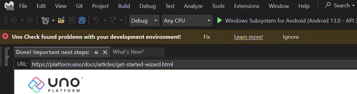
The first thing to be aware of after creating, or even opening an existing, Uno Platform application is any Uno Check prompts that might appear. If you see one of these prompts, take a few minutes to fix any of the identified issues, to avoid countless hours wondering why you can’t build, launch, debug or publish your application.
Once you’ve fixed any issues, you can go ahead and run the application – Both the Hot Reload and Hot Design experiences work with a running application. Check out the Hot Reload support matrix to determine whether to run with or without the debugger – Hot Reload is required for Hot Design, so make sure you pick the debugging option that enables Hot Reload.
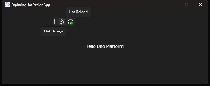
Studio Toolbar
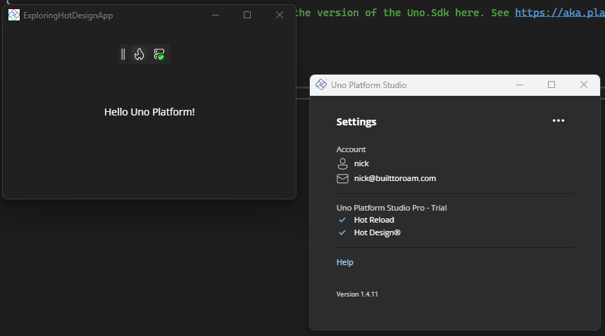
When you launch an Uno Platform application in debug, you’ll see the Studio Toolbar, which currently includes the Hot Design (left) and Hot Reload (right) icons.
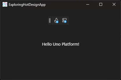
If instead the toolbar buttons appear with a blue dot (see below image), this means that you either don’t have an Uno Platform account, or you’re not signed into your account.
Clicking on either button will show a teaching tip with more information and a button to launch the Studio app, that comes with the IDE extension/plugin.
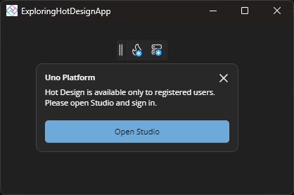
The Studio application will appear (if it’s not visible, it may have launched behind other windows) and will give you options to register or sign in. Both options require opening the Uno Platform website and creating or signing into your account.
Once you’re signed in, the buttons in the Studio toolbar will automatically update, as too will the information in the Studio app.
Launching Hot Design
Clicking the Hot Design button will launch the designer experience.
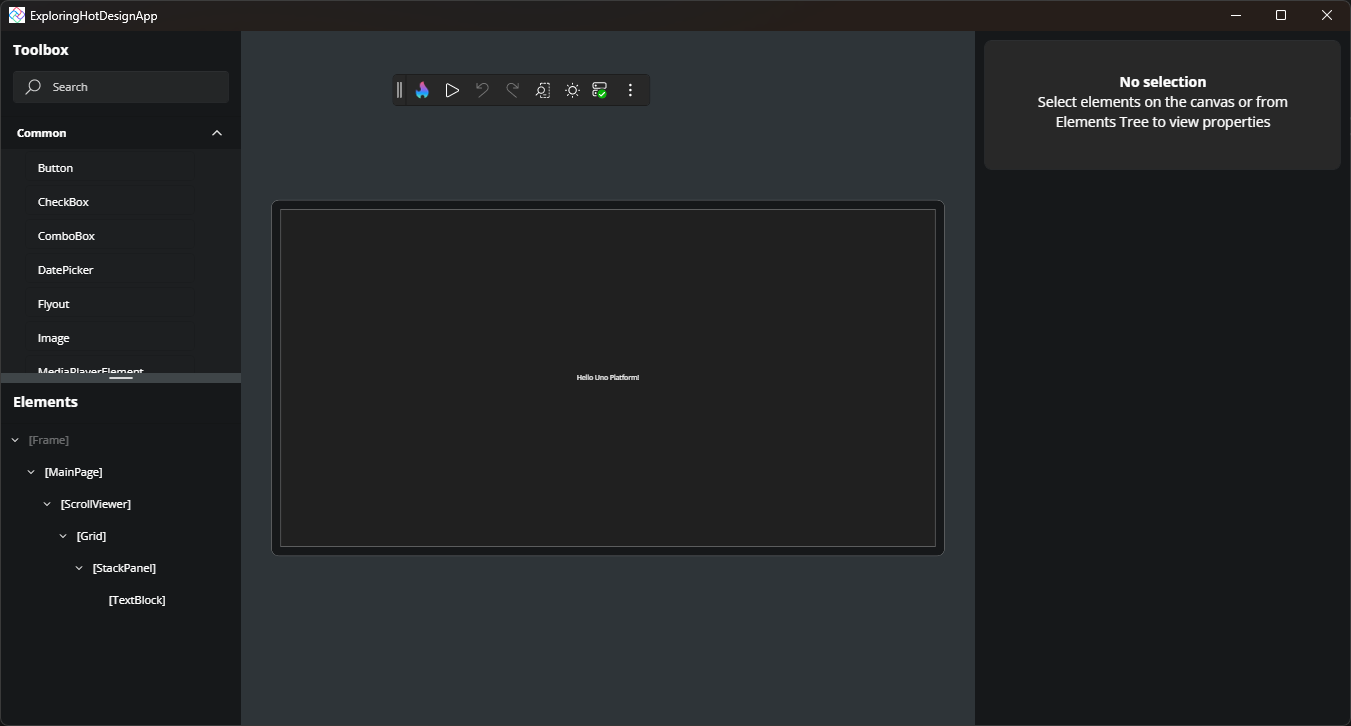
Toolbox
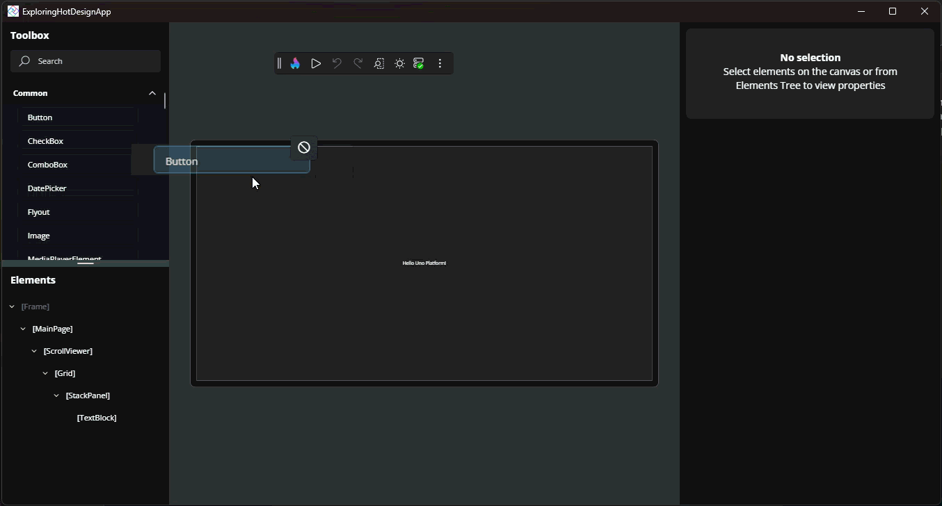
In the top-left is the Toolbox, listing available controls which can be added to the application.
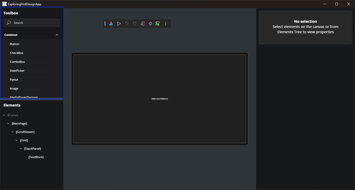
Controls in the Toolbox can be dragged onto either the canvas (design area in the middle) or the Elements tree
Elements
The Elements tree shows a hierarchical breakdown of the UI elements visible in the current Window.
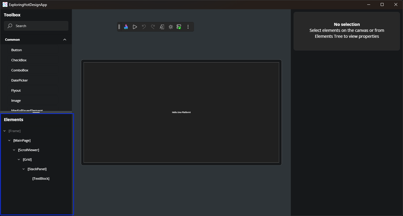
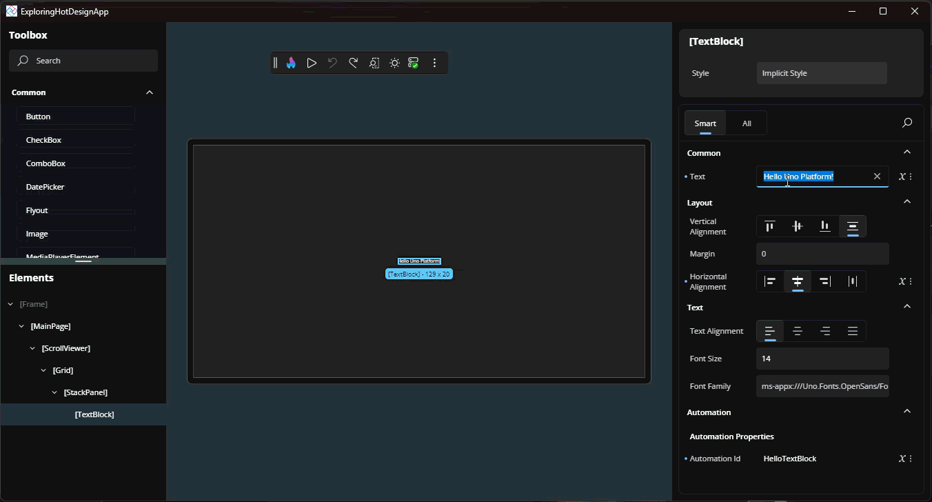
In the Elements tree existing elements can be individually, or multi, selected.
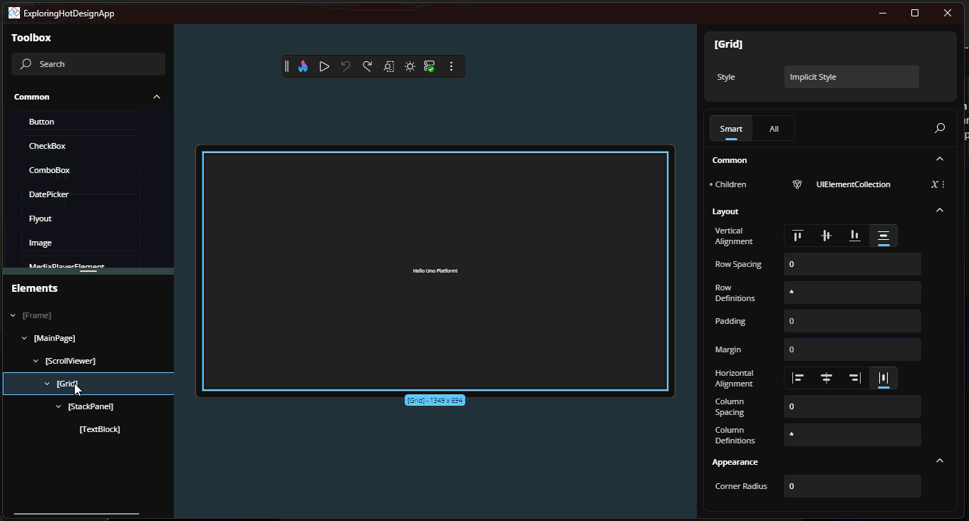
Properties
With items selected (either from the Elements tree, or clicking on them in the canvas), the available properites for the selected selements is available in the Properties.
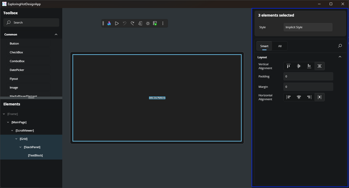
In addition to showing the current property values, the Properties can also be used to update property values.
Studio Toolbar
Once inside Hot Design, the Studio Toolbar transforms into a toolbar that assists with testing different form factors, different themes, toggling into interaction mode and performing undo/redo operations.
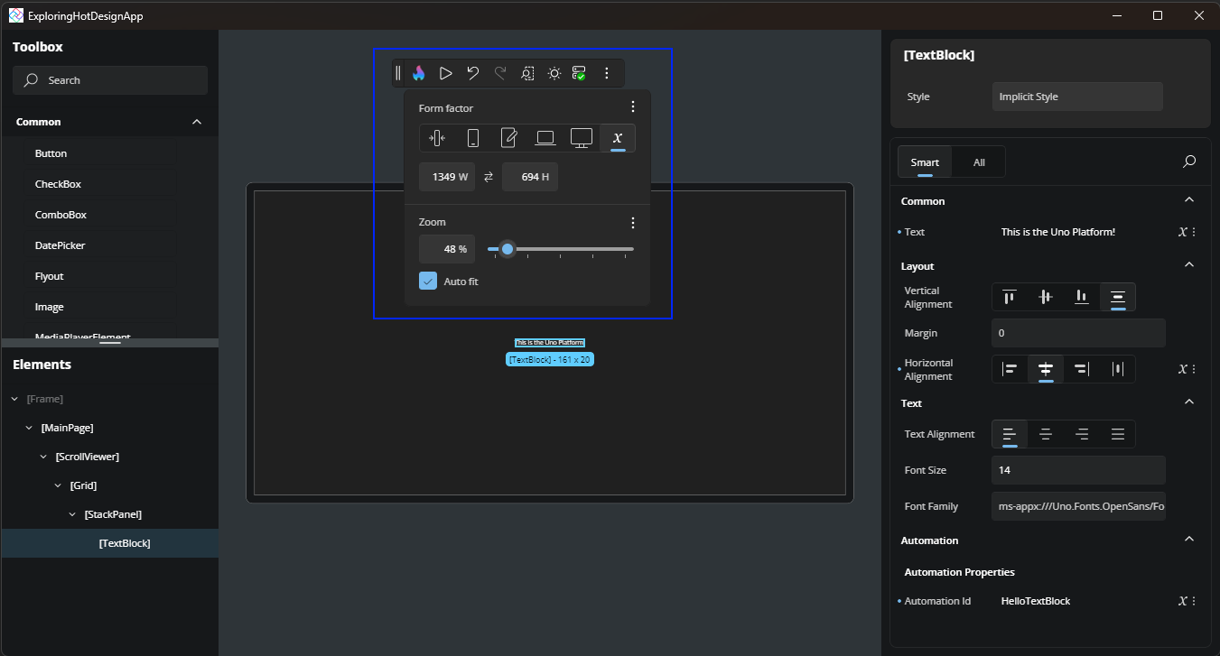
The form factor flyout allows for adjusting the design size of the application, with predefined devices sizes and the ability to enter a custom size. The flyout can also be used to adjust the zoom applied to the design canvas.
In this post we’ve touched on a few of the key tool windows that make up Hot Design. Stay tuned for more feature deep dives in the coming posts.